Energy Consumption in the US
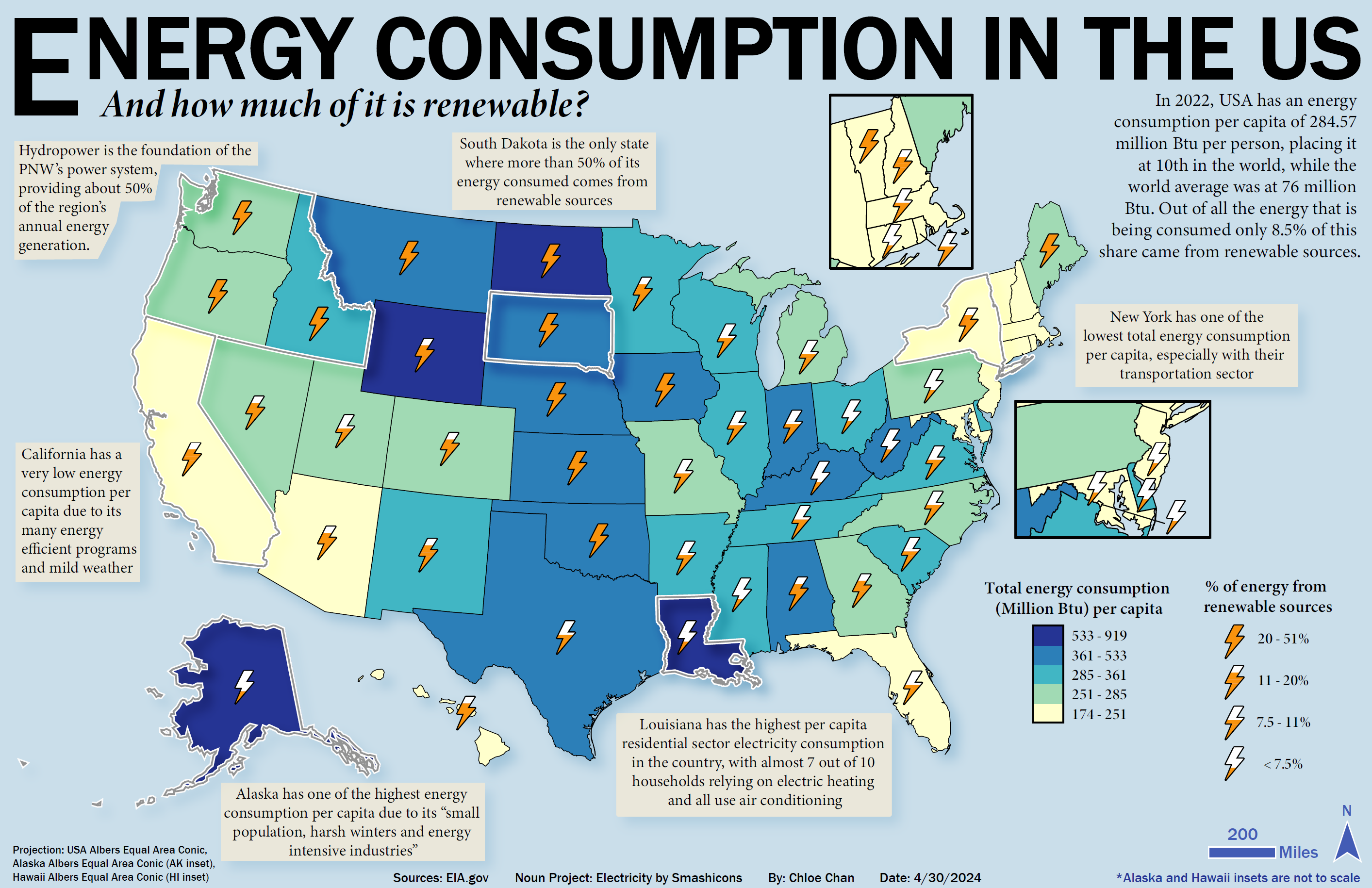
As part of the final lab of Geog 370, we had to make a map derived from cartographic techniques that we have learnt throughout the semester. I picked choropleth mapping and proportional symbols to convey the information. The choropleth map highlights how much energy is consumed by each state while the proportional symbol demonstrates how much of that energy originates from renewable sources.
